Audience and their problems first, copy second
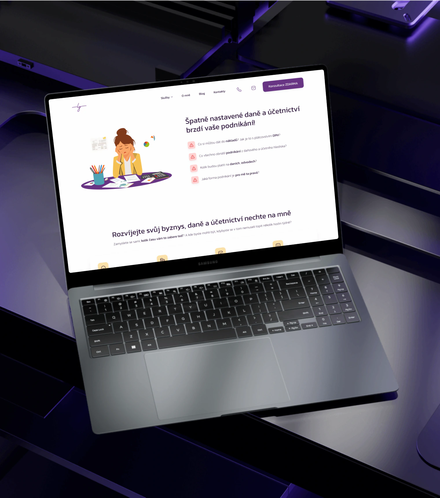
Why: We defined who Lucie's clients are and what bothers them about taxes and accounting. Every piece of copy on the website names their problem and shows that Lucie is the one to solve it.

“So many clients that I had to take the consultation button off my site.”
Lucie Ziebová, Tax Advisor
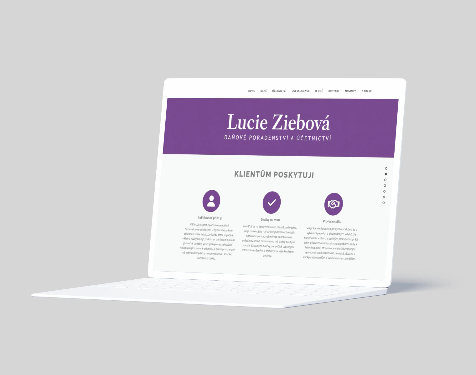
Lucie's clients came mostly through referrals, and that wasn't enough. At a marketing course, she decided to get visible on social media. To turn that into clients, she needed a website that turns people from social media into consultations. The old one was a template full of phrases like “personal approach”. Not a single button, not even a contact form.
“My clients only came through referrals. I wanted to be visible on social media, but I had nowhere to send people.”
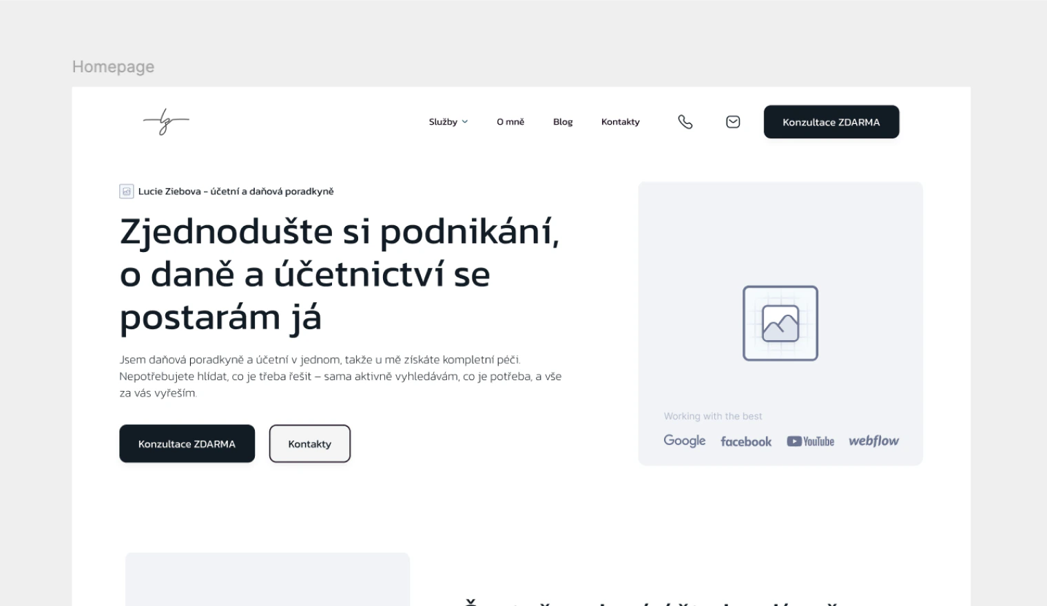
Before
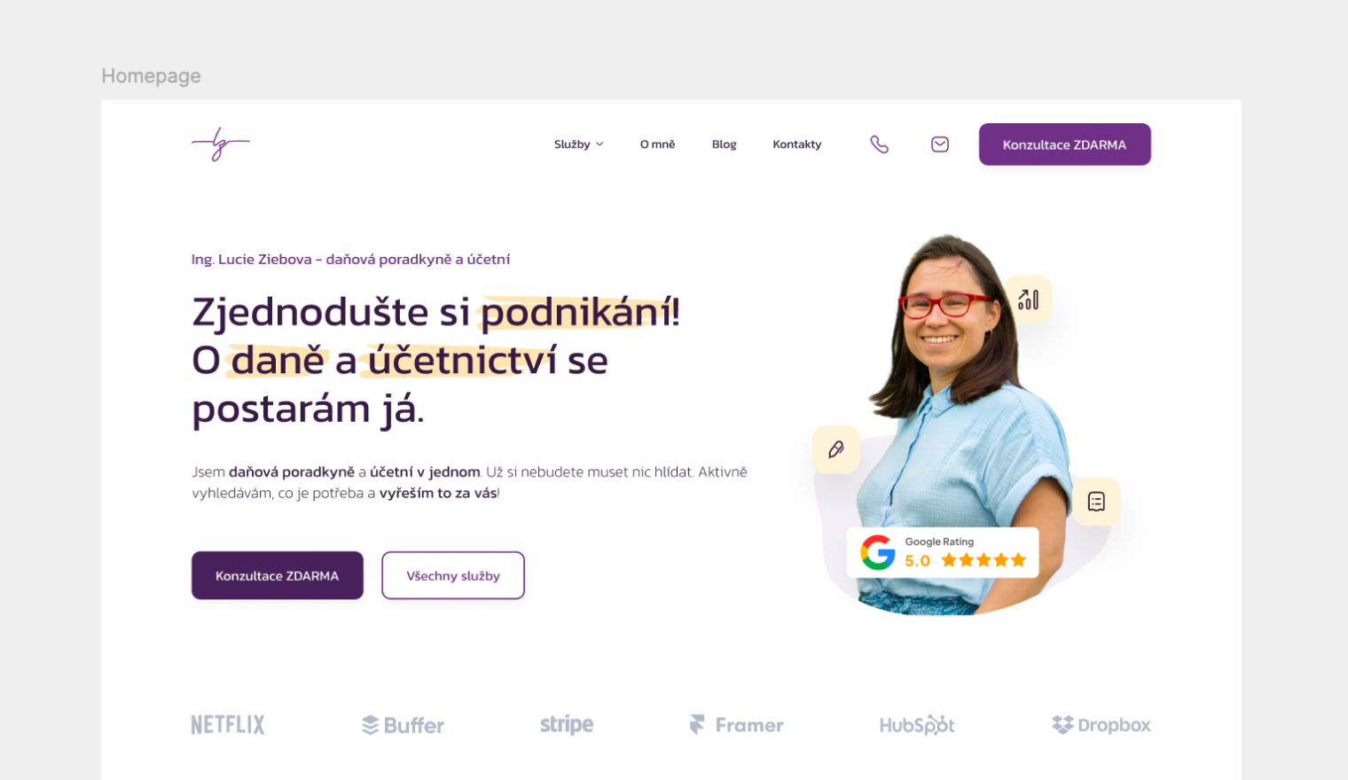
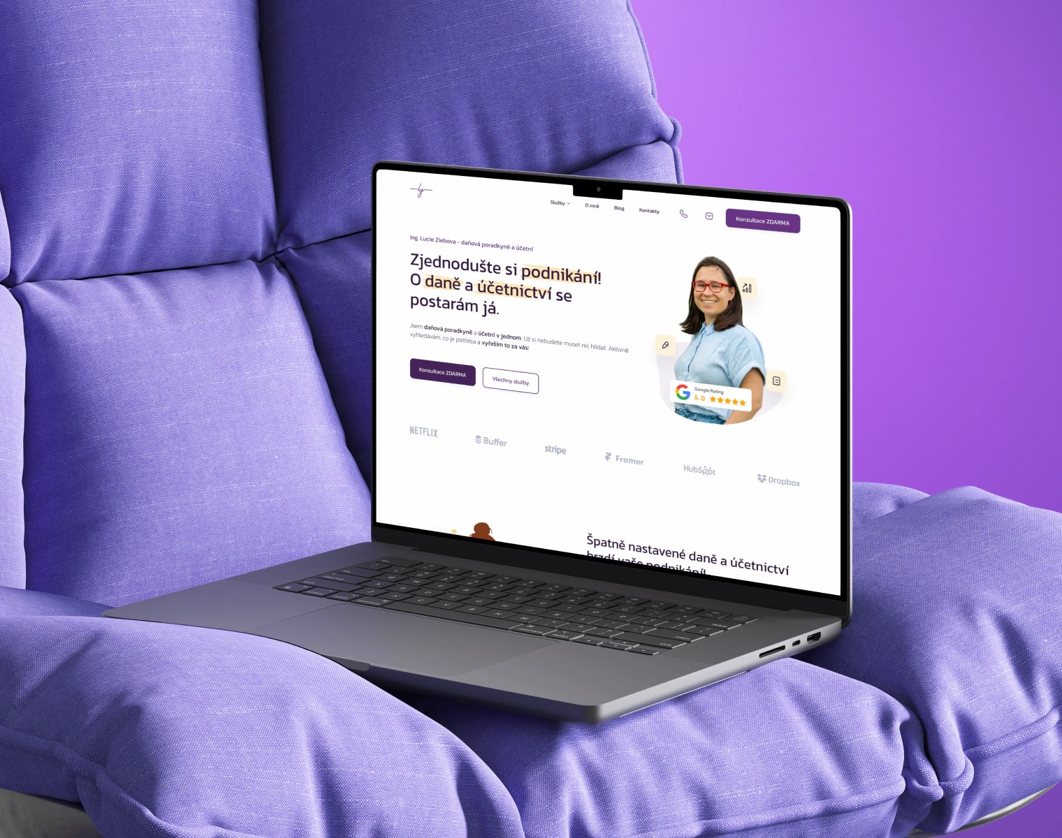
AfterWhy: We defined who Lucie's clients are and what bothers them about taxes and accounting. Every piece of copy on the website names their problem and shows that Lucie is the one to solve it.
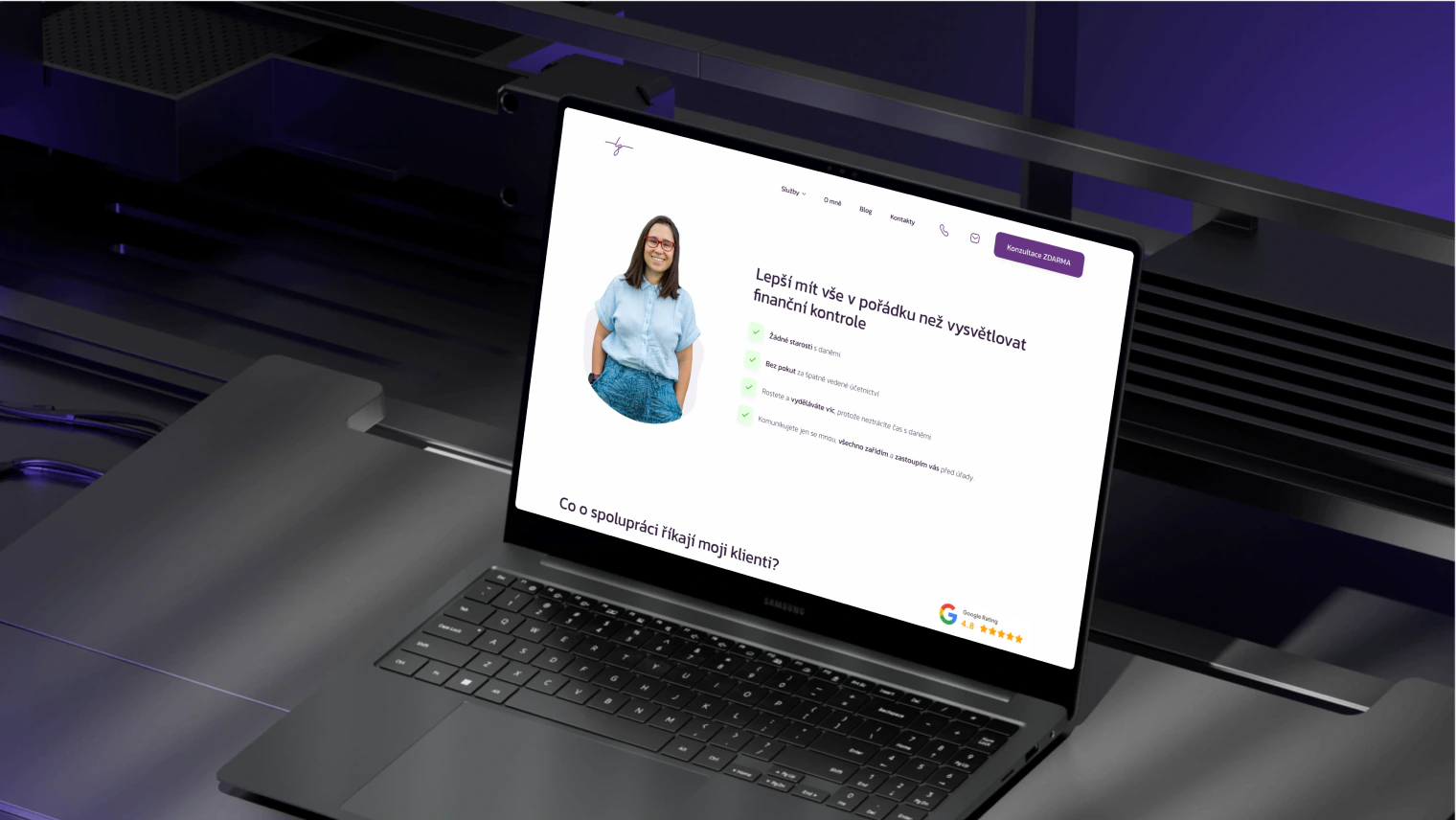
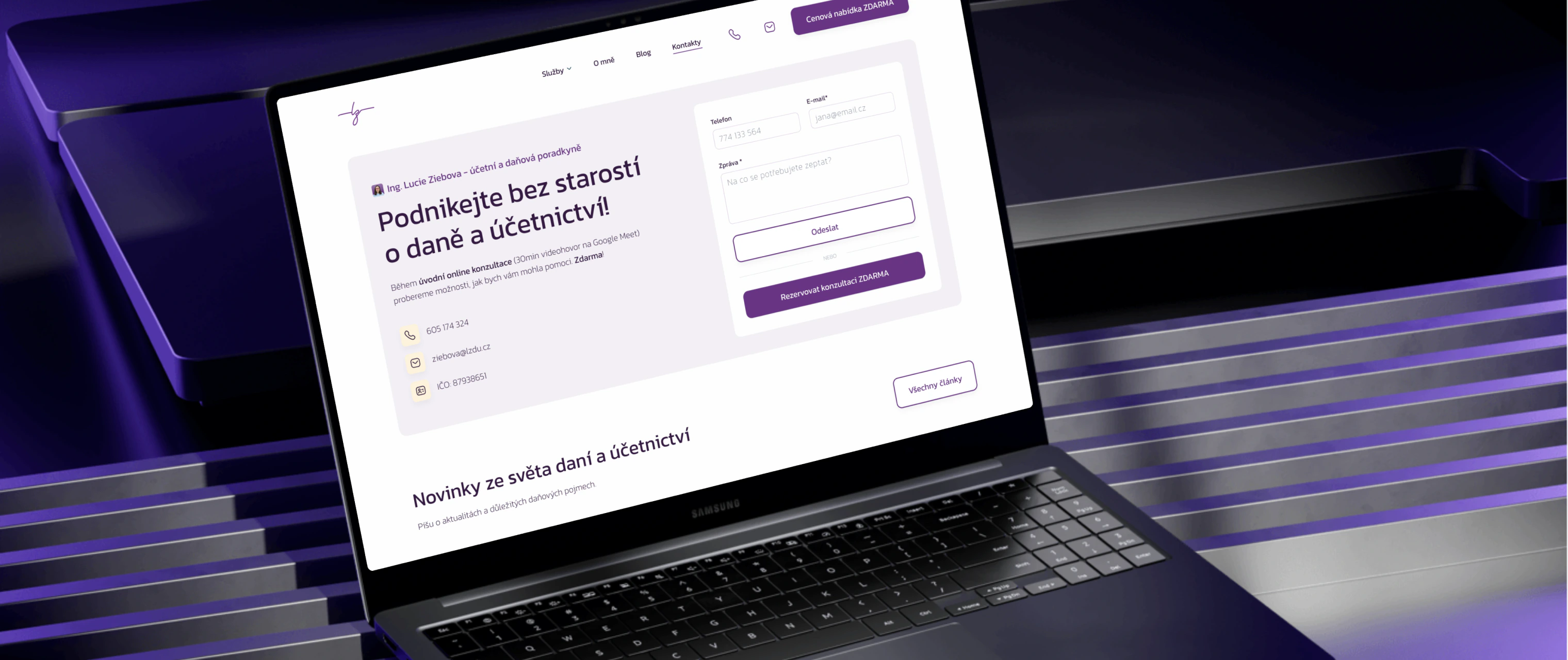
Why: People from social media don't know Lucie yet, and taxes stress them out. So the arguments go in an order that leads to the smallest possible step: a free, no-obligation consultation.
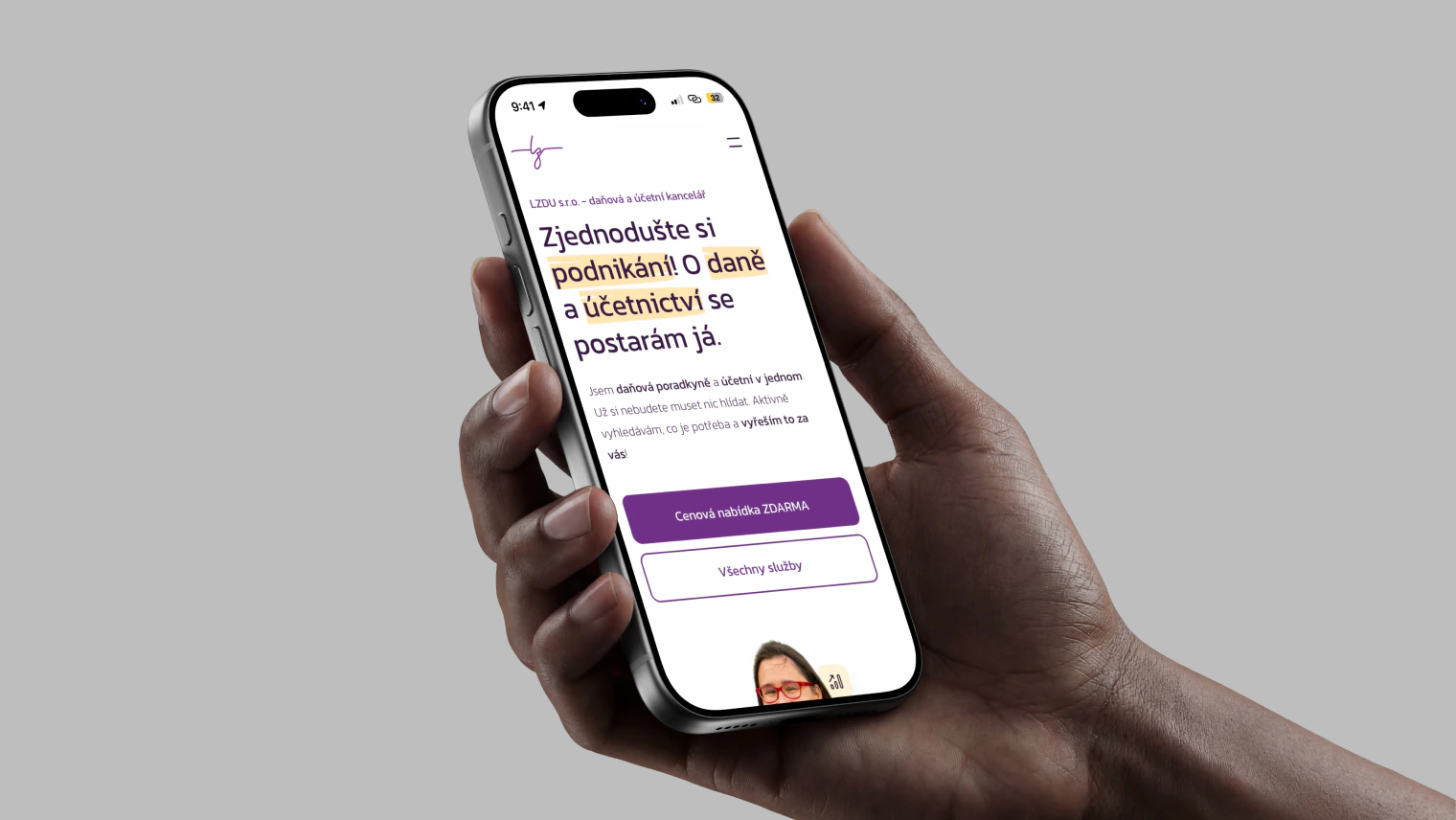
Why: Tax advisors' websites are bare and template-like. What sets Lucie apart is her approach and cheerfulness, so we showed them: funny photos, illustrations and purple instead of grey.
A new logo. Lucie mainly needed to get her social media going fast, not invest in a whole identity. The logo stayed as her signature, and we put our energy into a website that turns visits into consultations.
We didn't want to invest in a new logo at the start. From the purple Lucie already had, we pulled a few shades, the main button color and one accent color. Plus a typeface and social media post templates Lucie still uses today.


Kanit. Round and friendly, so taxes don't feel like a letter from the authorities.
Lucie's purple in several shades, with yellow as the only accent color.
The same colors and typeface on the website and in the post templates Lucie still uses on social media today.
We started the same way Lucie's clients start today: with a free consultation. What the website should do, and for whom.
We defined who Lucie's clients are and what tax and accounting problems they deal with.
From those problems, we built the arguments in the order in which booking Lucie makes sense. Lucie had the business logic well prepared from her marketing course.
Structure in wireframes, design in Figma with the purple and Lucie's photos. Then we built the website ourselves in Framer.


The calendar filled up so fast that Lucie had to hide the main free consultation button from the website. There were more clients than she could handle, so she hired an employee.
The freelancer is now an entrepreneur building her own company.
Data from Lucie Ziebová.
I want a similar result“Before, clients only came to me through referrals. The new website takes people from social media straight to a free consultation, and my calendar filled up 2 months ahead. In the end, there were so many clients that I had to hide the consultation button and hire an employee. From the start, they listened carefully and added their own ideas that took the website up another level.”