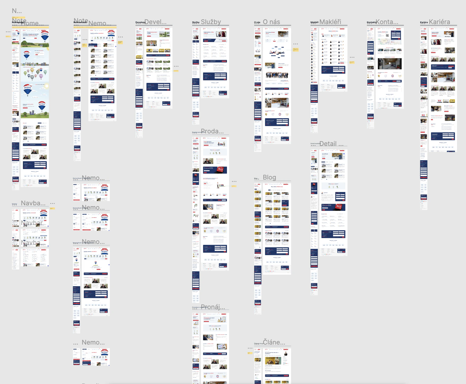
Price estimate as the main button
Why: If you want to sell or rent out, you first want to know how much you'll get. The form has 25–30 questions with conditional logic, and it's still quick to fill in. The whole website leads to it.

“Inquiries are up by half. And we didn't spend a penny more on marketing.”
Tomáš Šimek, Remax Delux
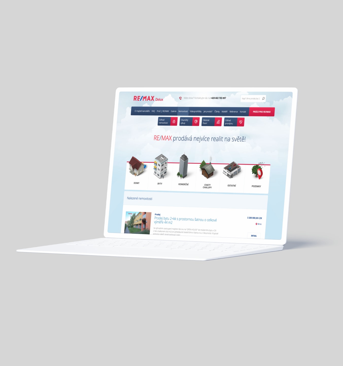
Remax Delux is one of the biggest real estate agencies in Brno. But the website worked like a business card: a contact form and nothing else. It needed to start bringing in people who want to sell or rent out a property.
“We had a contact form on the website and that was it. We relied on people finding us on their own.”
Before
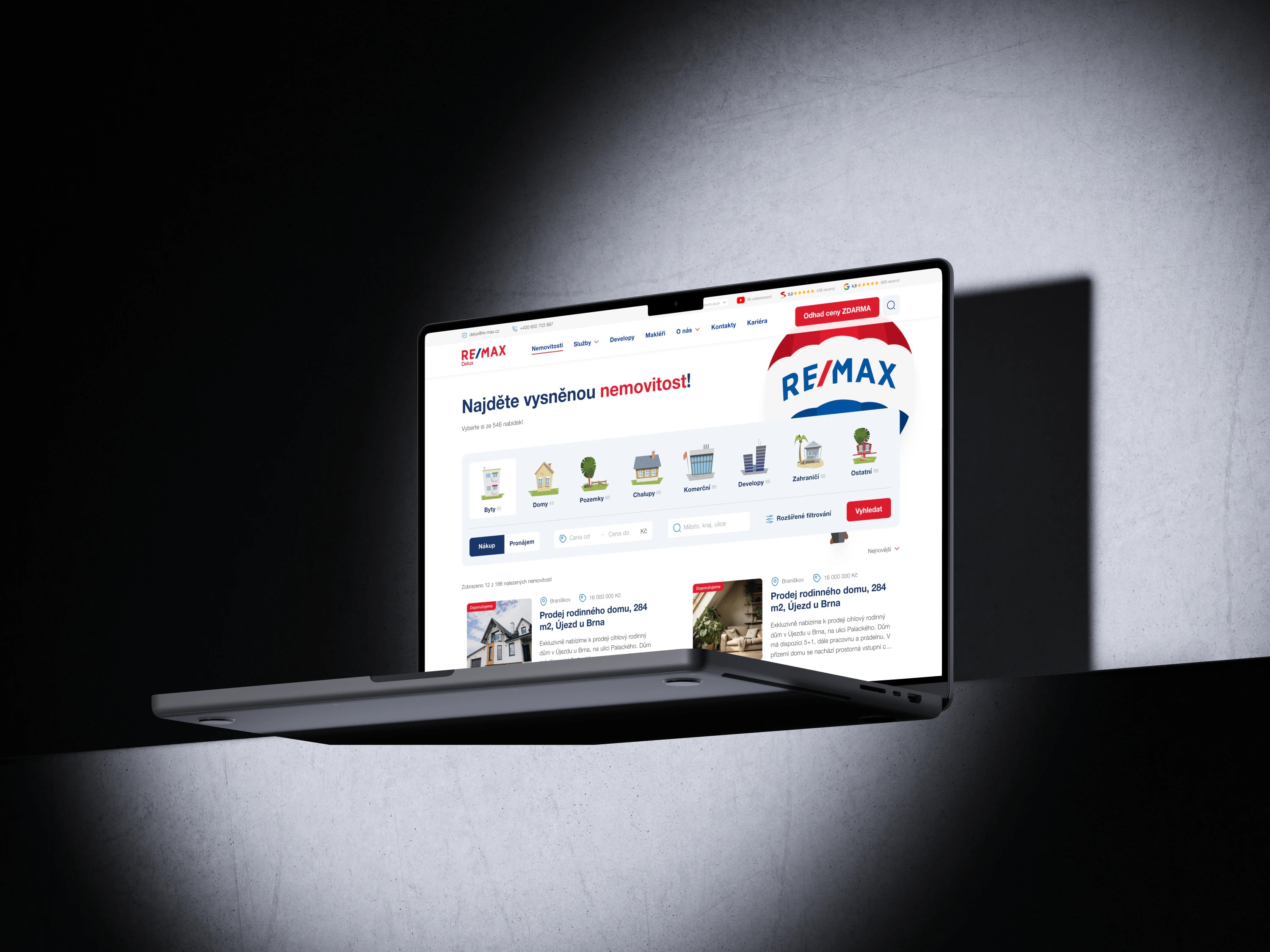
AfterWhy: If you want to sell or rent out, you first want to know how much you'll get. The form has 25–30 questions with conditional logic, and it's still quick to fill in. The whole website leads to it.
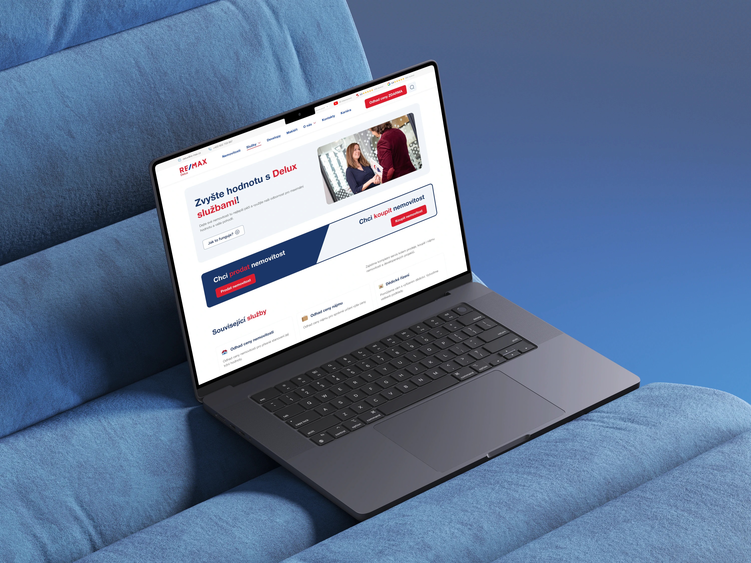
Why: Video reviews and Google reviews from real clients, five out of five across the board. On every page, they sit right next to the form or the price estimate banner.
Why: Instead of items like “About the owner” or “Gallery”, the menu leads to listings and services. Each service, such as home staging, has its own page, so you can send ads straight to it.
When the property someone is looking for isn't listed at the moment, the website offers to leave an email. As soon as one shows up, they get a notification. So visitors don't leave empty-handed.
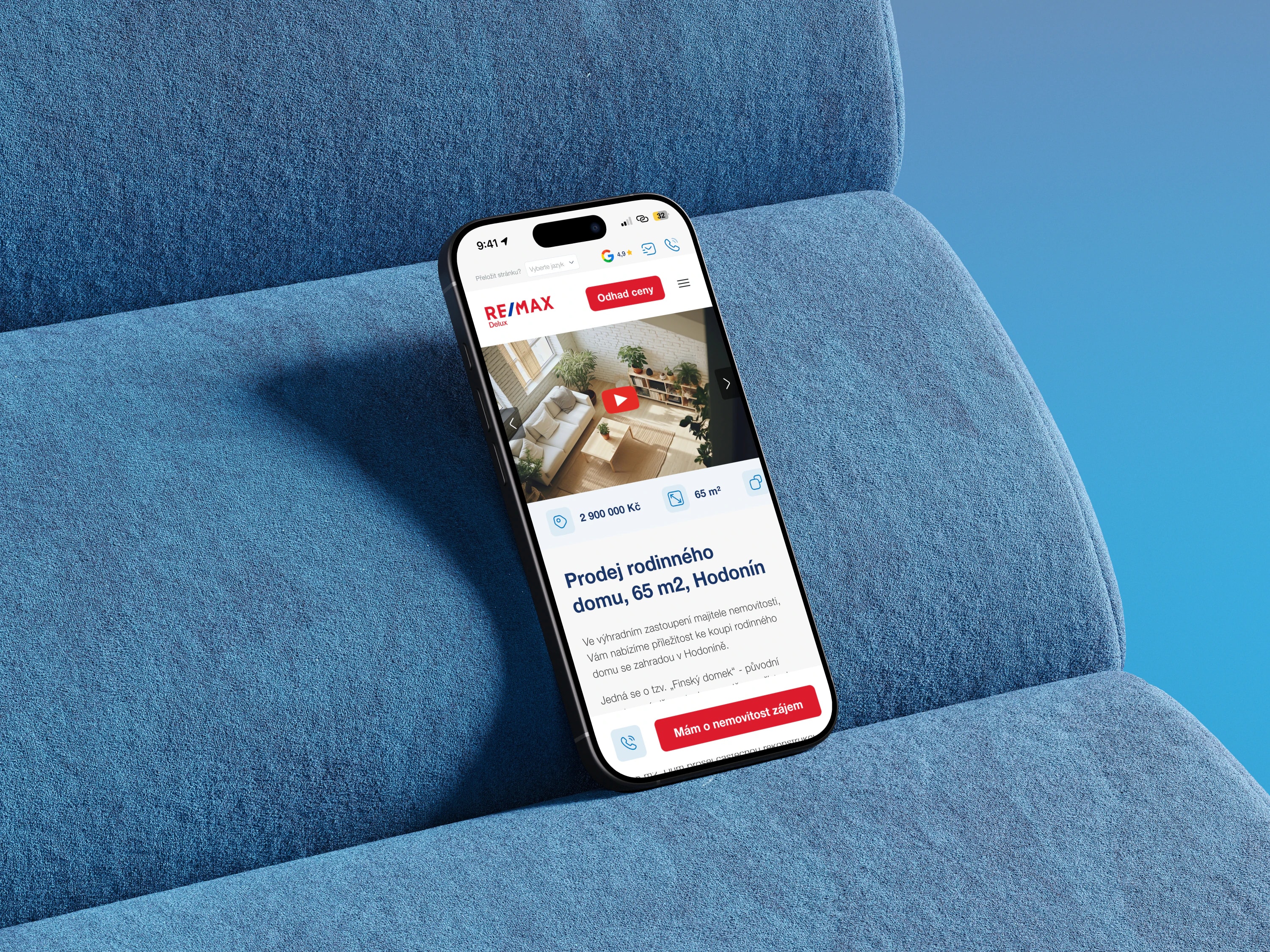
Animations, on the other hand, we kept only on the homepage. That's where they make the first impression: a balloon flies across the whole page and lands at the end. On a property detail page they would get in the way, though. People are there for information and they're used to how that kind of page looks. Taking that away would hurt inquiries rather than help.

RE/MAX is a franchise, so the logo, colors and typeface were given. We only tuned the colors to more modern shades. To set Remax Delux apart from the competition, we created custom illustrations and animations.


Helvetica, the RE/MAX brand typeface. It stayed so the website fits the rest of the communication.
RE/MAX blue and red, complemented by dark and light blue for text and surfaces.
The design system was the basis for both the quote and development. The website is built entirely from components and the developers had everything they needed.
What the website has to achieve and for whom. The main goal was clear: more inquiries.
Tomáš Šimek and his agents know the market and the competition. Their arguments and what clients told them are the foundation of the content.
Every two weeks we went through what was done together. Fewer revision rounds, no surprises at the end.
Visuals, illustrations and the design system. The developers got everything documented, from desktop to mobile.


Three months after launch, inquiries are up by half and traffic is a third higher. And the marketing budget didn't change.
The price estimate deserves most of the credit. That's how people who want to sell or rent out get in touch. Exactly the people a real estate agency needs most.
Data from the owner of Remax Delux. Measured 3 months after launch compared to the same period before the redesign.
I want a similar result“Before Dominik and I redid the website, we mostly relied on people finding us on their own. After the redesign, that turned around. We get 50% more inquiries and traffic went up by a third, without putting any more money into marketing.”