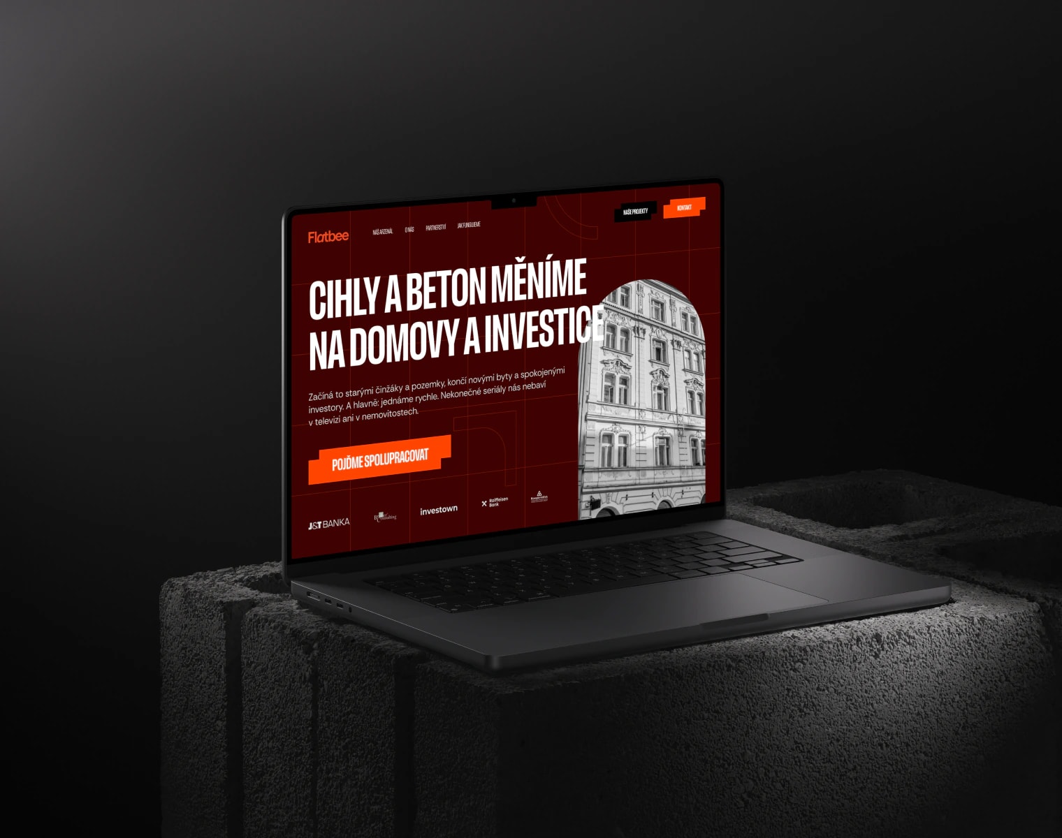
Unlike any competitor, thanks to a kick-ass website.

“Our website said the same thing as everyone else's. We wanted something with balls.”

Jakub Chodura, COO, Flatbee

ChallengeBland website, bold company
What we designedBrand & site for 2 audiences
Our roleBrand, UX, UI and Framer
ResultA site with balls
/Starting point(01)

Flatbee buys old apartment buildings and land, renovates them and turns the flats into homes and investments. They have almost CZK 1 billion in projects. But their old website looked outdated and untrustworthy. They wanted a brand and a website that aren't afraid to stand out.

“We wanted something kick-ass. Finally, we don't look like every other real estate agency.”

Jakub Chodura
Jakub ChoduraCOO, Flatbee
/Before and after(02)

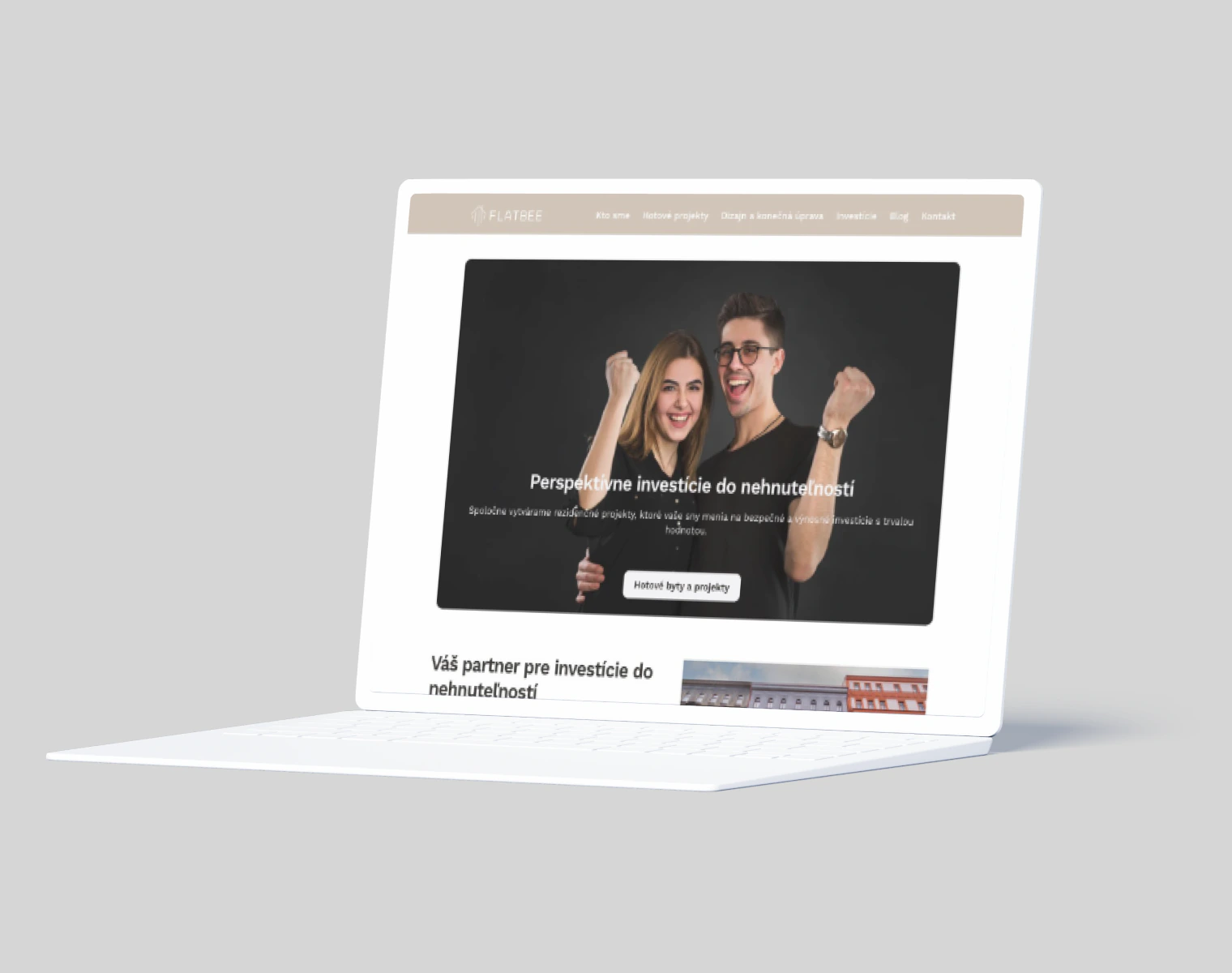
From a beige bar and a forgettable logo to a brand you can't miss.

Website before the redesignBefore
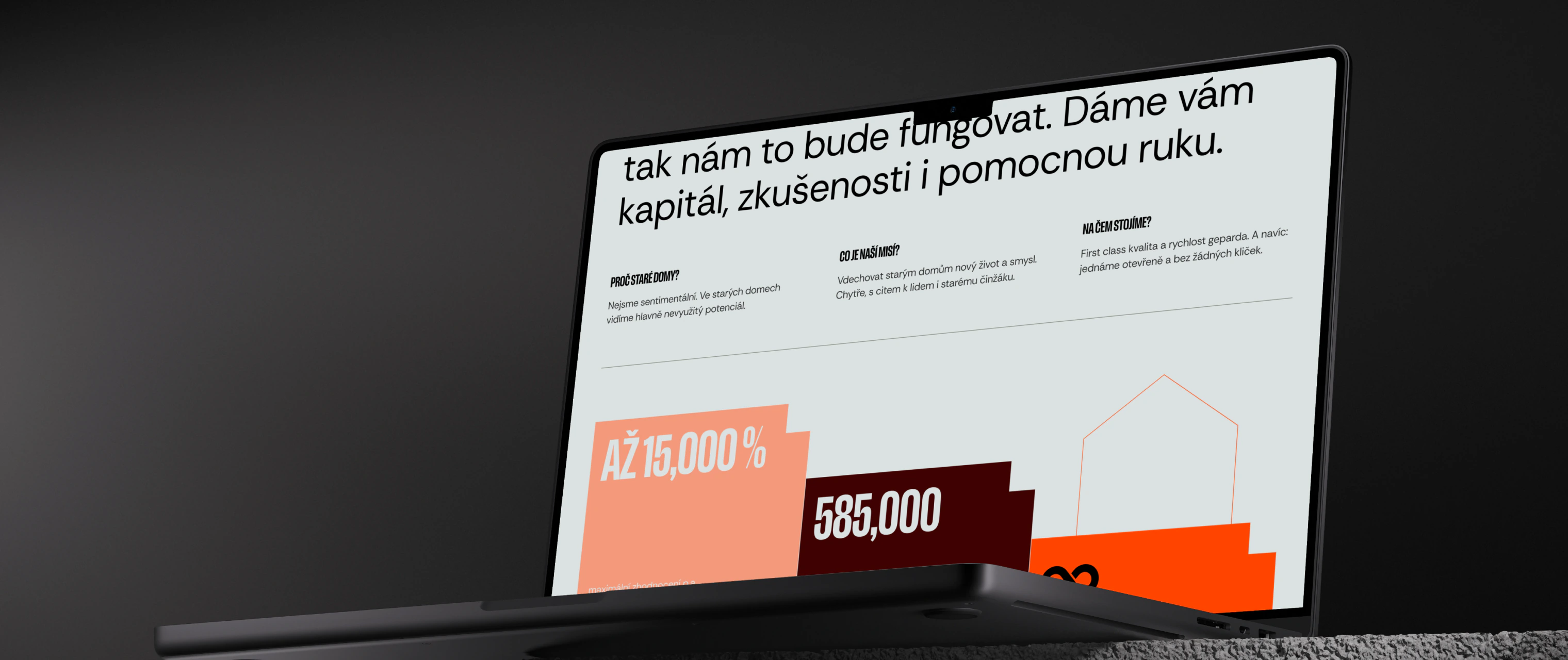
Website after the redesignAfter
/What we did and why(03)

3 decisions that set Flatbee apart from other real estate firms.

01

Both audiences, site-wide

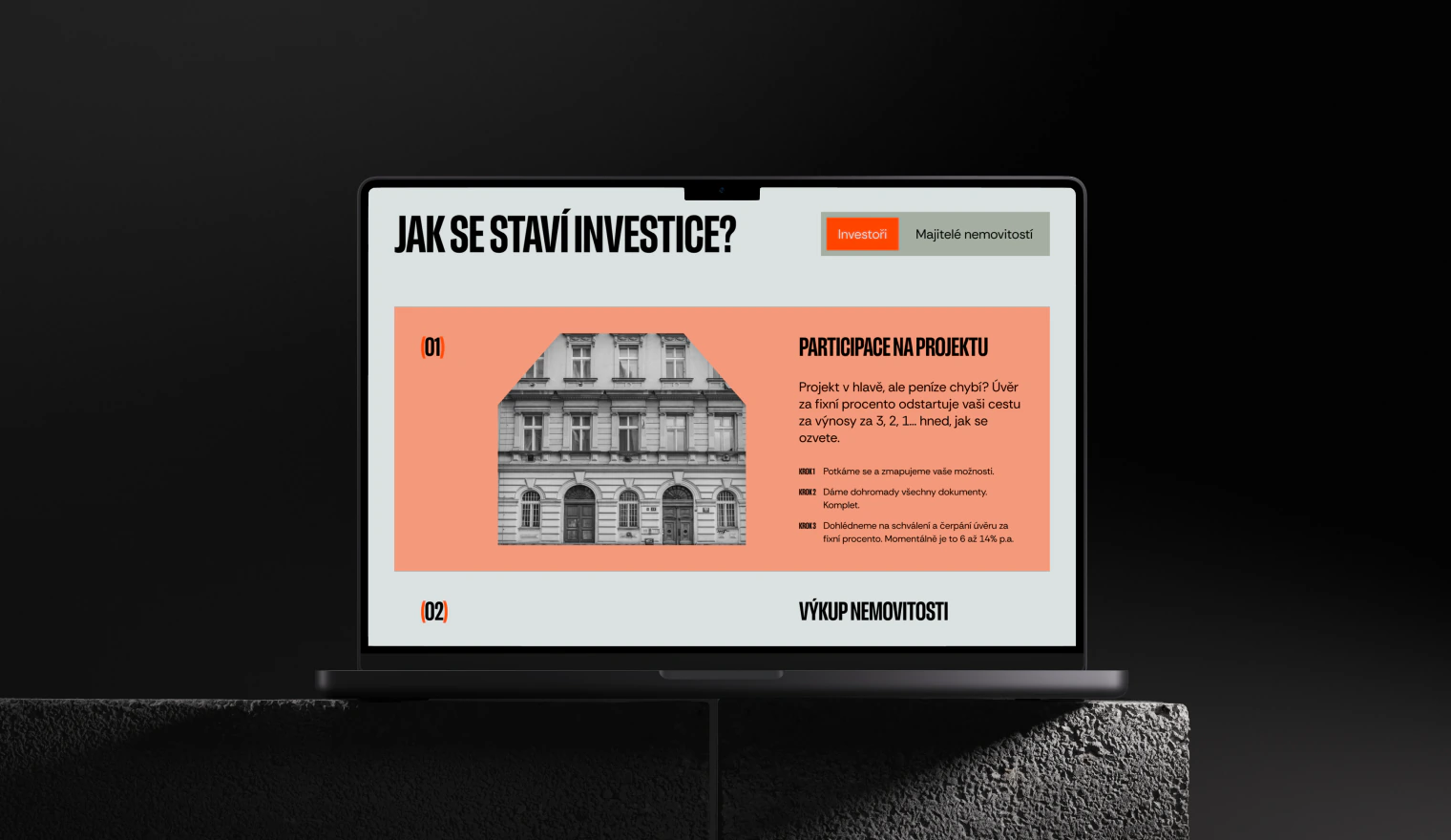
Why: Flatbee works with investors as well as property owners who don't have the money to renovate. So the website keeps showing how it works and what's in it for both sides, making it clear the partnership makes sense for each of them.

Impactinvestors and owners alike know what Flatbee offers them
02

Trust: numbers, team, reviews

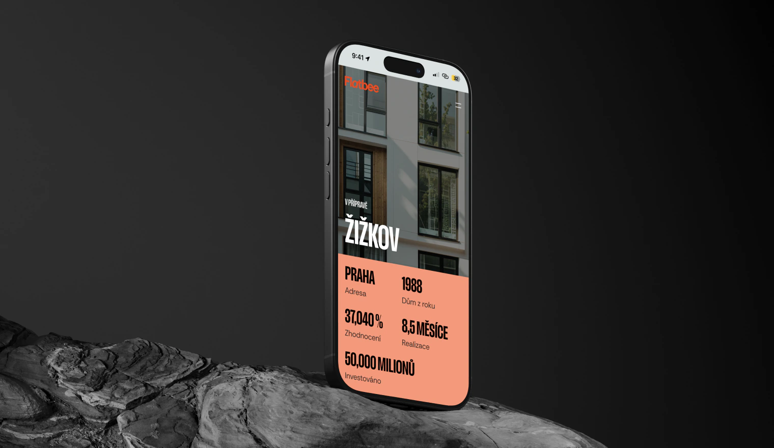
Why: For a company managing assets worth almost CZK 1 billion, trust is what decides. That's why we show returns and active projects, the whole team with photos, reviews from real clients and project case studies.

Impacttrustworthy at first glance
03

Bold, not real estate grey

Why: Real estate websites all look the same. Flatbee got big typography, bold colors, brutal orange buttons and plenty of animations and micro-interactions.

ImpactFlatbee stands out from the competition

What we added on top

Each way of working together is laid out step by step, so investors and property owners know what, where and how.

At the end of the page, a big contact form. Anyone who reads this far knows why they should get in touch.

/Brand(04)

Brick, concrete and an orange you can't miss.

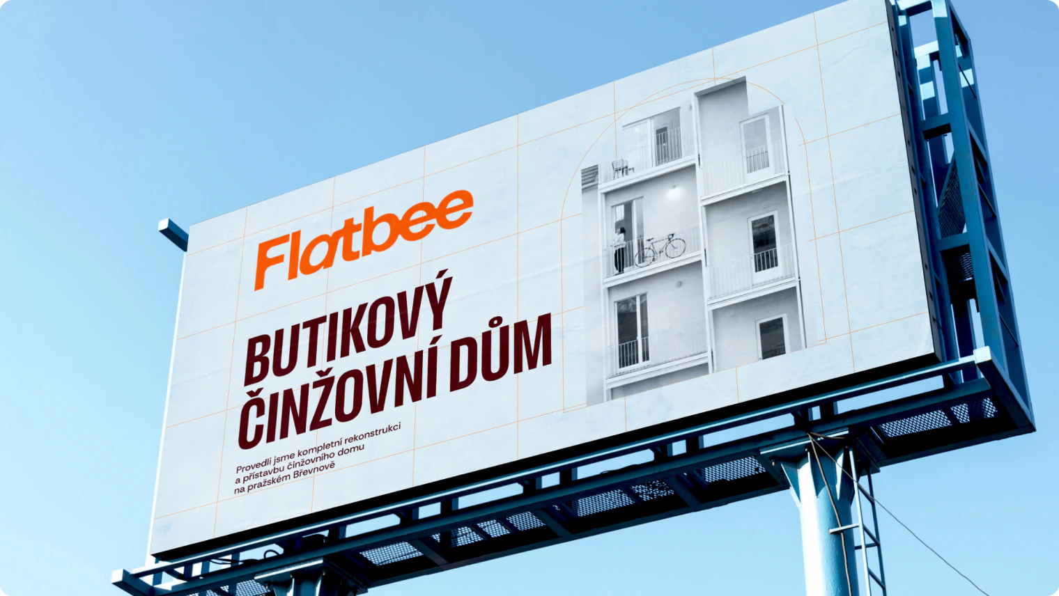
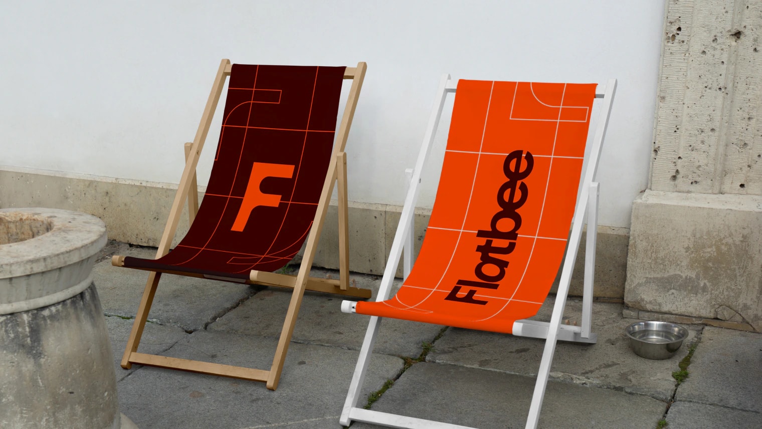
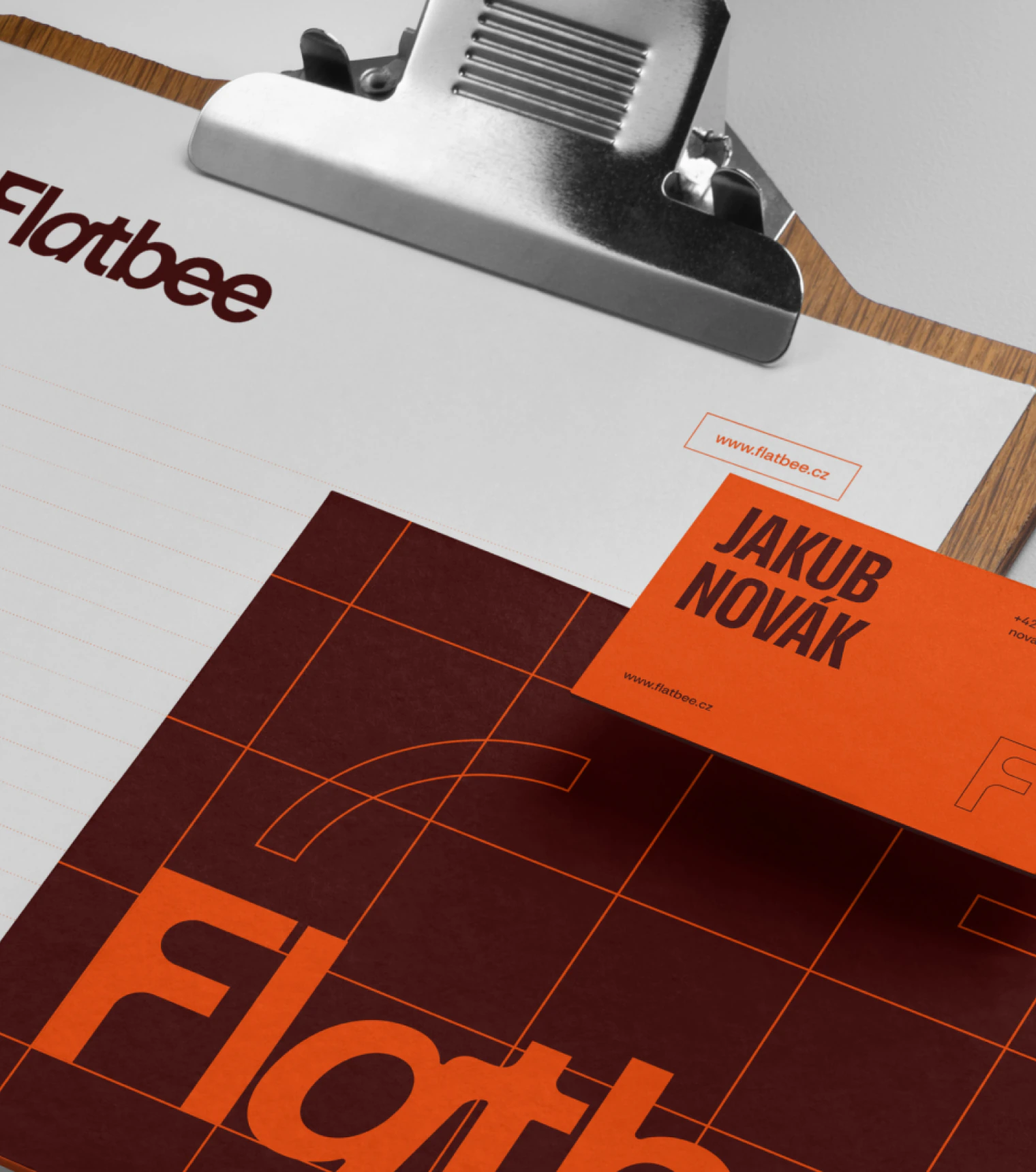
Flatbee brings old apartment buildings back to life, so the brand by designer Lucie Hájková comes straight from the construction site. Burgundy like fired brick, grey like raw concrete and brick orange like warning tape. Narrow bold headings have the punch of signs on scaffolding. The website takes this language and sets it in motion.

TypographyAa

Lektorat Condensed for headings, Rethink Sans for body text. Narrow, bold and big.

Colors

Burgundy, brick orange and concrete grey. Apricot and vintage green as accents.

Oldest house1881

The year the oldest apartment building Flatbee is now bringing back to life was built. The brand has to suit buildings over 140 years old too.

/Process(05)

From moodboard to launch in 1.5 months.

01

Brand

Moodboard, concept, final brand and brand manual.

02

Info architecture

Website moodboard and a structure for 2 audiences: investors and property owners.

03

Wireframes, design

From wireframes to hi-fi design, including a design system. A call every week where we showed the next piece and fine-tuned changes.

04

Built in Framer

We built the website in Framer ourselves, including all the animations and micro-interactions.

/What the client says(07)

“We wanted a website that would be kick-ass, and we got even more. The brand, animations and micro-interactions all fit together. Investors and property owners see right away that we're different.”

Jakub Chodura
Jakub ChoduraCOO, Flatbee